Blog Index
The journal that this archive was targeting has been deleted. Please update your configuration.
Navigation

As a part of my teaching practice, through the blog Drawing Connections, I share with my students a variety of references from the field. Creativity, communication, invention, and design innovation are the broad thematic blog categories.

Entries in drawing tips (4)

Saturday
Jul142007

One Point Perspective: Adoration of the Magi

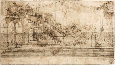
Adoration of the Magi, by Leonardo da Vinci. "The preparatory drawing for the “Adoration of the Magi,” the painting commissioned to da Vinci for the main altar of the monastery of San Donato a Scopeto near Florence, reveals the Italian genius’s innovative approach to art. His originality and mastery of perspective are evident in the magnitude of the illusionary space that he created. He drew the ground first, then a plan for the buildings and finally animated the scene with human figures and animals. Using a millimetric ruler, appointed stylus and very fine threads, da Vinci created the perspective grid to transfer the drawing on a larger scale as a painting on a wooden panel." From Share the Perspective of Genius: Leonardo's Study for the Adoration of the Magi, an online exhibition hosted by The Library of Congress.

Leonardo da Vinci's work is really wonderful to look at when learning about drawing, not only how to draw in perspective, but also how to build form with line, to represent volume, to diagram, to explain thoughts, and so on.

With regard to perspective, as it is represented in Adoration of the Magi, see the following observations: Notice vanishing lines lead to a central point, called the central vanishing point. There is only one vanishing point in this drawing, and therefore we call it a one-point perspective drawing. The point at which the central vanishing point sits is called the eye level, or horizon line. For those viewers who are are not familiar with thinking of space depicted in perspective, note how objects that are closer to the viewer are larger, and objects that are more distant appear to be smaller. Imagine standing on a long stretch of flat road. One can see the painted lines of the road converging and eventually merging at a place where the road seems to disappear. It is that point which is called the "vanishing point."

The Museum of Science has an online exhibition, Leonardo da Vinci: Scientist, Inventor, Artist, featuring Leonardo da Vinci. Below is an exerpt from one section, titled Artist:

"Leonardo got his start as an artist around 1469, when his father apprenticed him to the fabled workshop of Verocchio. Verocchio's specialty was perspective, which artists had only recently begun to get the hang of, and Leonardo quickly mastered its challenges. In fact, Leonardo quickly surpassed Verocchio, and by the time he was in his early twenties he was downright famous.

Renaissance Italy was centuries away from our culture of photographs and cinema, but Leonardo nevertheless sought a universal language in painting. With perspective and other realistic elements, Leonardo tried to create faithful renditions of life. In a culture previously dominated by highly figurative and downright strange religious paintings, Leonardo's desire to paint things realistically was bold and fresh. This call to objectivity became the standard for painters who followed in the 16th century.

No slouch when it came to the techniques of the day, Leonardo went beyond his teaching by making a scientific study of light and shadow in nature. It dawned on him that objects were not comprised of outlines, but were actually three-dimensional bodies defined by light and shadow. Known as chiaroscuro, this technique gave his paintings the soft, lifelike quality that made older paintings look cartoony and flat. He also saw that an object's detail and color changed as it receded in the distance. This technique, called sfumato, was originally developed by Flemish and Venetian painters, but of course Super-Genius Leonardo transformed it into a powerful tool for creating atmosphere and depth.

Ever the perfectionist, Leonardo turned to science in the quest to improve his artwork. His study of nature and anatomy emerged in his stunningly realistic paintings, and his dissections of the human body paved the way for remarkably accurate figures. He was the first artist to study the physical proportions of men, women and children and to use these studies to determine the "ideal" human figure. Unlike many of his contemporaries -- Michelangelo for example -- he didn't get carried away and paint ludicrously muscular bodies, which he referred to as "bags of nuts."

All in all, Leonardo believed that the artist must know not just the rules of perspective, but all the laws of nature. The eye, he believed, was the perfect instrument for learning these laws, and the artist the perfect person to illustrate them."
Monday
Jul092007

The Invention of Drawing: An Artist Reveals Perspective

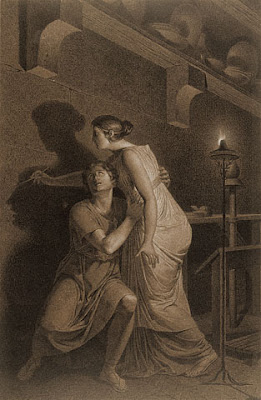
The Getty Museum has this wonderful drawing, The Invention of Drawing, which documents one method of drawing. Illustrated here is an artist tracing the shadow of her model. Notice how the drawing is a precise rendering, done in two-point perspective. A single flame provides the light source for all of the shadows. The drawing contains a full range of values, from lightest lights to darkest darks. The horizon line, or eye level, is low, almost, if not exactly where the pencil touches the wall. Perspective lines are dramatically featured in the wall-mounted shelf, the lines of the furniture, and the stone wall grid.

Perspective drawing is a method of representing the appearance of objects, places, architecture and even people. Parallel lines are represented as converging, which gives the illustion of distance. There are many valuable sources to which one can refer in order to understand perspective. The following link is one good example that covers the basics of linear perspective.

Image information:
The Invention of Drawing (recto); Sketch of Lower Leg Bones of Human Skeleton (verso)
Joseph-Benoît Suvée
Belgian, about 1791
Black and white chalk on brown paper (recto); graphite (verso)_21 1/2 x 14 in.
87.GB.145

Sunday
Jun242007

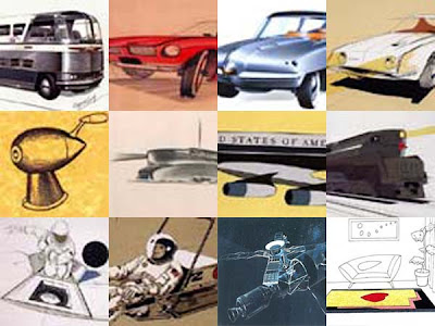
Rendering for Industrial Design: A Look at Raymond Lowey

About This Drawing:
Raymond Lowey created this Skylab rendering on a dark indigo blue background. Line work is done mostly in white pencil and highlights are white gouache paint. The background color is very much a part of the object. See how much of the paper actually shows through the object. Refined details, like parting lines, fasteners, surface texture, and a strong indication of light direction give the viewer plenty of significant information. Notice how the drawing is done in three-point perspective, close to the horizon line, with the vanishing points far off to each side. This effect gives the object a convincing, life-like appearance, as it is one of the most familiar ways one encounters or sees the world around them.

Drawing Tips:
1. Allow the background color to be an active part of the drawing. Avoid overworking the surface. Keep the drawing fresh and unlabored, providing only important information.
2. Include a variety of details that help the viewer understand the object, including clues regarding material, function, texture, weight, scale, volume, and context. Whenever it makes sense to do so, include an indication of human scale, as it will lend volumes of information to the piece.
3. For a convincing portrayal of drawn objects, be aware the principles of perspective. Place objects in the center of the cone of vision and close to the horizon line.
4. Including light and shadow in the drawing will help the viewer understand the figure ground relationship, time of day, light source, and three-dimensional volume.
If you would like to work on this technique, use a Canson toned paper (or similar), Prismacolor colored pencils (or similar), pastel powder mixed with baby powder and gouache.

Lowey Drawings:

About Lowey:
“The Shell logo. The Greyhound bus. The S-1 locomotive. The Lucky Strike package. The Coldspot refrigerator. The Studebaker Avanti. These and many other modern design icons were all created by Raymond Lowey, "the father of industrial design." Arguably one of the most influential designers of the 20th century, Loewy has been called the "man who shaped America." He left his mark countless times on everyday culture from household products, to transportation to corporate identity. Loewy was one of the first designers to understand the link between design and the economy. He expressed this connection by stating: "Between two products equal in price, function, and quality, the better looking will outsell the other."
Raymond Loewy (1893-1986), a brilliant designer and, without doubt, the most versatile ambassador of this discipline, became a design legend in his own lifetime. He was the most influential protagonist of industrial design that North America has ever known and has had a significant impact on the tastes and lifestyles of several generations. Loewy’s design philosophy still has an influence on the industrial design world today.” – This brief excerpt is from Art Net. See http://www.art.net/Lile/loewy/loewy.html

Wednesday
Jun062007

30 Drawing Reference Books for Artists, Designers and Anyone Who Wants to Learn How-To Draw

Not so long ago, in Victorian times (1837-1901), the “drawing room” referred to a place for comfortable, relaxed entertaining. The expression is still used in Britain, and in France, the term is “salon,” in the U.S., the equivalent is “living room.” For artists, the drawing room is not confined to one environment, although the studio may be where much of the work is accomplished, it is everywhere the artist is. Drawing happens anywhere, anytime.

Drawing is an empowering life tool accessible to anyone who cares to use it. Perception, communication, persuasion, innovation and invention – drawing develops these skills, which are transferable to any profession or subject.

“If you can draw, even a little bit, you can express all kinds of ideas that might otherwise be lost - delights, frustrations, whatever torments you or pleases you.” – David Hockney

“In the design process, drawing is the act of thought.” – Richard MacCormac

“Drawings are an invaluable aid to my mathematical thinking and an essential ingredient of most of my mathematical expositions.” – Sir Roger Penrose

“I use drawing as an extension of my brain. It is the ones done with spontaneity that give me most pleasure and help crystalise an idea.” – Terence Conran

Learning to draw can be likened to learning a language. It requires exposure, observation, exploration and practice. Learn to draw. Expose your mind to the variety of methods, tools, techniques and forms of drawing. Visit an art museum and observe how artists use drawing. Read books about drawing. Experiment with drawing by trying it out, emulating different styles, using a variety of drawing materials. Make drawing a part of your routine. Make room for drawing.

A German proverb says, “Whoever cares to learn will always find a teacher.” Books are a great place to start. The following is an alphabetical list of recommended books relating to drawing for architecture, animation, exhibit design, fine art, industrial design, and interior design.

1. Drawing in Early Renaissance Italy: Revised Edition
2. Drawing Now: Eight Propositions
3. The Art of Robots
4. Classical Drawing Atelier: A Contemporary Guide to Traditional Studio Practice
5. Art of Drawing

6. Design Drawing
7. Drawing: A Creative Process
8. Drawing and Perceiving: Life Drawing for Students of Architecture and Design
9. Vitamin D: New Perspectives in Drawing
10. Keys to Drawing with Imagination: Strategies and Exercises for Gaining Confidence and Enhancing Your Creativity

11. Color Drawing: Design Drawing Skills and Techniques for Architects, Landscape Architects, and Interior Designers
12. Drawing Lessons from the Great Masters: 100 Great Drawings Analyzed, Figure Drawing Fundamentals Defined
13. Rapid Viz : A New Method for the Rapid Visualization of Ideas
14. Drawing From The Modern
15. Experimental Drawing

16. Drawing Shortcuts: Developing Quick Drawing Skills Using Today's Technology
17. Drawing and Designing with Confidence: A Step-by-Step Guide
18. Freehand Perspective for Designers: Including Shadow-Casting and Entourage
19. Force: Dynamic Life Drawing for Animators
20. Syd Mead's Sentury

21. Basic Perspective Drawing: A Visual Approach
22. Perspective Drawing and Applications
23. Perspective for Interior Designers
24. Drawing: A Contemporary Approach
25. Rendering in Mixed Media

26. From Ordinary To Extraordinary: Art & Design Problem Solving
27. Basic Visual Concepts And Principles For Artists, Architects And Designers
28. The Animator's Workbook: Step-By-Step Techniques of Drawn Animation
29. Life Drawing: A Journey to Self-Expression
30. Design Principles and Problems

Do you have a recommendation? Please share!

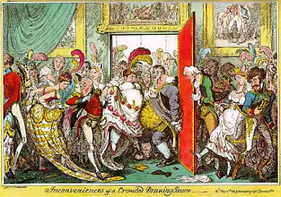
Image Reference: "Inconveniences of a Crowded Drawing Room", famous caricature by George Cruikshank, May 6th 1818.