Blog Index
The journal that this archive was targeting has been deleted. Please update your configuration.
Navigation

As a part of my teaching practice, through the blog Drawing Connections, I share with my students a variety of references from the field. Creativity, communication, invention, and design innovation are the broad thematic blog categories.

Entries in design process (9)

Tuesday
Jul242007

Chuck Close: A Systematic Approach to Portraiture

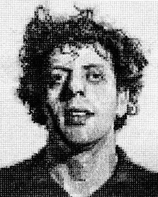
In this collage portrait of Phillip Glass, titled Phillip, by Chuck Close, one can see an overall structure of tonal values, whereby the artist successfully employs a full range in scale of white-to-black. Notice how values are placed according to similarity and proximity, and it is this carefully selected combination that makes it possible to render the portrait. Also, see how significant the grid system is in this piece, with incremental units evenly divided.

In order to create such a rendered composition, one must acutely observe the subtle shifts in light and shadow, form and volume. It is an organized, laborious, and systematic approach to constructing an image, and relies on the artist's ability to maintain extreme focus at every stage of the execution.

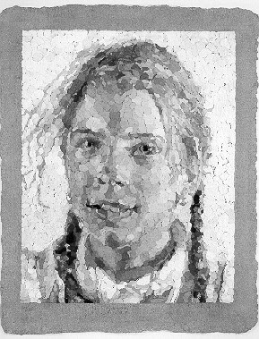
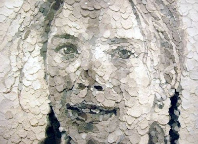
This can be seen in another Chuck Close example of a portrait, titled Georgia, which is constructed of handmade paper. Evident, as with so many incredible examples of his work, is his highly methodological, formal analysis of information.


"The remarkable career of artist Chuck Close extends beyond his completed works of art. More than just a painter, photographer, and printmaker, Close is a builder who, in his words, builds "painting experiences for the viewer." Highly renowned as a painter, Close is also a master printmaker, who has, over the course of more than 30 years, pushed the boundaries of traditional printmaking in remarkable ways.

Almost all of Close’s work is based on the use of a grid as an underlying basis for the representation of an image. This simple but surprisingly versatile structure provides the means for "a creative process that could be interrupted repeatedly without…damaging the final product, in which the segmented structure was never intended to be disguised." It is important to note that none of Close's images are created digitally or photo-mechanically. While it is tempting to read his gridded details as digital integers, all his work is made the old-fashioned way—by hand.

Close’s paintings are labor intensive and time consuming, and his prints are more so. While a painting can occupy Close for many months, it is not unusual for one print to take upward of two years to complete. Close has complete respect for, and trust in, the technical processes—and the collaboration with master printers—essential to the creation of his prints. The creative process is as important to Close as the finished product. "Process and collaboration" are two words that are essential to any conversation about Close’s prints." – via Chuck Close: Process and Collaboration

Links:
Chuck Close Exhibit at the Walker
Chuck Close Exhibit at the MOMA
Chuck Close Portfolio at Pace Prints
Self Portraits: Young Artists Create Oil Pastel Mosaics
Young Students Collaborate to Make a Portrait

Saturday
Jul142007

One Point Perspective: Adoration of the Magi

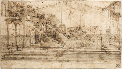
Adoration of the Magi, by Leonardo da Vinci. "The preparatory drawing for the “Adoration of the Magi,” the painting commissioned to da Vinci for the main altar of the monastery of San Donato a Scopeto near Florence, reveals the Italian genius’s innovative approach to art. His originality and mastery of perspective are evident in the magnitude of the illusionary space that he created. He drew the ground first, then a plan for the buildings and finally animated the scene with human figures and animals. Using a millimetric ruler, appointed stylus and very fine threads, da Vinci created the perspective grid to transfer the drawing on a larger scale as a painting on a wooden panel." From Share the Perspective of Genius: Leonardo's Study for the Adoration of the Magi, an online exhibition hosted by The Library of Congress.

Leonardo da Vinci's work is really wonderful to look at when learning about drawing, not only how to draw in perspective, but also how to build form with line, to represent volume, to diagram, to explain thoughts, and so on.

With regard to perspective, as it is represented in Adoration of the Magi, see the following observations: Notice vanishing lines lead to a central point, called the central vanishing point. There is only one vanishing point in this drawing, and therefore we call it a one-point perspective drawing. The point at which the central vanishing point sits is called the eye level, or horizon line. For those viewers who are are not familiar with thinking of space depicted in perspective, note how objects that are closer to the viewer are larger, and objects that are more distant appear to be smaller. Imagine standing on a long stretch of flat road. One can see the painted lines of the road converging and eventually merging at a place where the road seems to disappear. It is that point which is called the "vanishing point."

The Museum of Science has an online exhibition, Leonardo da Vinci: Scientist, Inventor, Artist, featuring Leonardo da Vinci. Below is an exerpt from one section, titled Artist:

"Leonardo got his start as an artist around 1469, when his father apprenticed him to the fabled workshop of Verocchio. Verocchio's specialty was perspective, which artists had only recently begun to get the hang of, and Leonardo quickly mastered its challenges. In fact, Leonardo quickly surpassed Verocchio, and by the time he was in his early twenties he was downright famous.

Renaissance Italy was centuries away from our culture of photographs and cinema, but Leonardo nevertheless sought a universal language in painting. With perspective and other realistic elements, Leonardo tried to create faithful renditions of life. In a culture previously dominated by highly figurative and downright strange religious paintings, Leonardo's desire to paint things realistically was bold and fresh. This call to objectivity became the standard for painters who followed in the 16th century.

No slouch when it came to the techniques of the day, Leonardo went beyond his teaching by making a scientific study of light and shadow in nature. It dawned on him that objects were not comprised of outlines, but were actually three-dimensional bodies defined by light and shadow. Known as chiaroscuro, this technique gave his paintings the soft, lifelike quality that made older paintings look cartoony and flat. He also saw that an object's detail and color changed as it receded in the distance. This technique, called sfumato, was originally developed by Flemish and Venetian painters, but of course Super-Genius Leonardo transformed it into a powerful tool for creating atmosphere and depth.

Ever the perfectionist, Leonardo turned to science in the quest to improve his artwork. His study of nature and anatomy emerged in his stunningly realistic paintings, and his dissections of the human body paved the way for remarkably accurate figures. He was the first artist to study the physical proportions of men, women and children and to use these studies to determine the "ideal" human figure. Unlike many of his contemporaries -- Michelangelo for example -- he didn't get carried away and paint ludicrously muscular bodies, which he referred to as "bags of nuts."

All in all, Leonardo believed that the artist must know not just the rules of perspective, but all the laws of nature. The eye, he believed, was the perfect instrument for learning these laws, and the artist the perfect person to illustrate them."

Sunday
May202007

Imaginary City Envisioned in Drawings

In 1984 Gilles Tréhin, dedicated artist and artistic savant, began designing an imaginary city, Dumont d'Urville, using primarily drawings to communicate his vision.


Additional info:
Gilles Trehin.com
Gilles Trehin and the city of Urville

Friday
May182007

Google SketchUp: 3D Modeling for Everyone


All things being Google, why not a virtual world, one in which any individual can participate in the design process, conceptualizing architecture, landscapes and objects in 3D drawing models, then inserting them into a collectively built, real-world coordinate planet Earth? Google Earth. Yes, using Google SketchUp, anyone can draw. SketchUp is an accessible 3D drawing software tool that was developed for the early, conceptual stages of design. Google offers a FREE version, or a professional version for $495.

Info:
Google SketchUp. Explore a virtual model of Google #D Warehouse
See a wide array of model examples in the Featured Collections area of the Google 3D Warehouse.
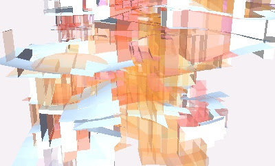
Fred Bartels is doing some interesting drawing experiments. See examples of his work in the The Abstract Art section of the Google 3D Warehouse. The image shown here is titled Hidden Figure, by Fred Bartels.

Thursday
May102007

Problem Solving Lab

"The Design Science Lab is a rigorous, hands-on training in the problem solving, planning and design methodology called Design Science, pioneered by Buckminster Fuller and other visionaries. Participants engage in a whole systems and anticipatory approach to develop strategies to solve global and local problems that is based on innovation and thrives on transparency."

The 2007 Design Science Lab Workshop will be held in New York City at the United Nations and United Nations International School from Friday, June 22nd to Friday, June 29th.

Application Deadline: May 20th