Blog Index
The journal that this archive was targeting has been deleted. Please update your configuration.
Navigation

As a part of my teaching practice, through the blog Drawing Connections, I share with my students a variety of references from the field. Creativity, communication, invention, and design innovation are the broad thematic blog categories.

Entries in drawing (17)

Sunday
Jul222007

Hand-Drawn Lettering and Experimental Typography

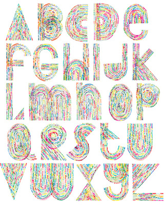
This beautifully hand drawn alphabet is by Blake E. Marquis.

Graphic designers take note, there is an interesting traveling exhibition, titled Alphabet: An Exhibition of Hand-Drawn Lettering and Experimental Typography, which can be viewed now in Orlando, coinciding with the AIGA Conference.

“Focusing on an ordinary subject that we see each day, often in the hundreds of thousands, Alphabet presents 26 letters as more than just shapes for conveying information. The 48 artists and designers in this show conceive and interpret the alphabet in surprising and inventive ways, ranging from graceful and polished to witty and unconventional. The 60 alphabets featured in Alphabet were created by artists in North America, Europe, and Asia, and represent work from well-known typographers and designers as well as rising artists and design students.” – excerpt from the exhibition website.

ALPHABET GALLERY
Below are selected samples of some of the alphabets shown in the exhibition. Complete character sets (A-Z) of each alphabet in the show can be seen in the exhibition catalog or at one of the exhibition venues.
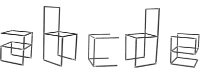
ANDREW BYROM / INTERIORS / 2003
A set of 26 table and chair frames built from steel tubing, Interiors forms a lowercase alphabet when viewed from certain angles. While some of the letters such as the h, m, and b look like basic chairs or tables, others like the e, t, and x become abstract, rather than functional, furniture.
Fabrication: Joel Wolter
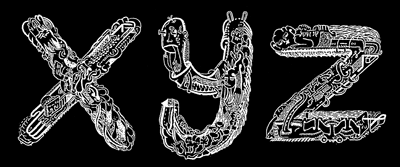
LUKE RAMSEY AND A. PURDY / HYPER TYPE / 2005
Representing the pair's first collaboration, Hyper Type's obsessively detailed letterforms were created by Ramsey and Purdy in two marathon, ten-hour days.
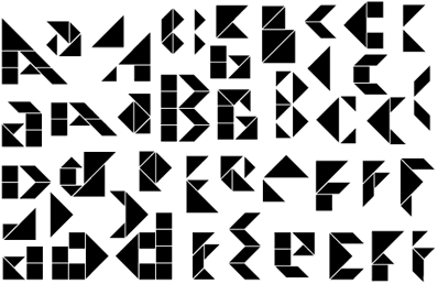
APIRAT INFAHSAENG / SEVEN BOARD OF CUNNING / 2004
Constructed with Chinese Tangram puzzle tiles, Seven Board of Cunning takes the concept of Tangrams--that the tiles may be arranged into a variety of shapes--and applies it to typography, creating multiple versions of each letter.

MICHAEL STOUT (VISUALINGUAL) / IMAGEABILITY, PATHS / 2002
Pushing the limits of legibility, Imageability is a series of five fonts based on ideas from the book of the same title by Kevin Lynch. By reducing each letter to a minimal set of forms, Imageability explores the identifiers we use to navigate our landscape and language.

Exhibition info:
Website

Travel information
Alphabet will be traveling through 2008. Upcoming and past shows include:
October-November 2008 / Southern Illinois University / Edwardsville, IL
December 2007 / Ohio Northern University / Ada, OH
October 2007 / Cooper Union / New York, NY
July 2007 / AIGA Orlando / Orlando, FL
February-March 2007 / Minneapolis College of Art & Design / Minneapolis, MN
January 2007 / Pennsylvania College of Art & Design / Lancaster, PA
November 2006 / Northern Illinois University / DeKalb, IL
March 2006 / Workhorse Gallery / Los Angeles, CA
January-February 2006 / M-80 / Milwaukee, WI
November 2005 / Heaven Gallery / Chicago, IL
August 2005 / Lump Gallery / Raleigh, NC
July 2005 / Maryland Institute College of Art / Baltimore, MD

Select list of artists, designers and students, who are featured in the exhibit:
Andrew Byrom
Danielle Foushee
Arjen Noordeman
Paul Nudd
C.W. Roelle
Visualingual
Saturday
Jul142007

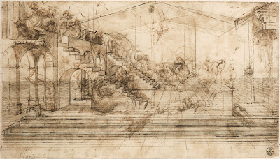
One Point Perspective: Adoration of the Magi

Adoration of the Magi, by Leonardo da Vinci. "The preparatory drawing for the “Adoration of the Magi,” the painting commissioned to da Vinci for the main altar of the monastery of San Donato a Scopeto near Florence, reveals the Italian genius’s innovative approach to art. His originality and mastery of perspective are evident in the magnitude of the illusionary space that he created. He drew the ground first, then a plan for the buildings and finally animated the scene with human figures and animals. Using a millimetric ruler, appointed stylus and very fine threads, da Vinci created the perspective grid to transfer the drawing on a larger scale as a painting on a wooden panel." From Share the Perspective of Genius: Leonardo's Study for the Adoration of the Magi, an online exhibition hosted by The Library of Congress.

Leonardo da Vinci's work is really wonderful to look at when learning about drawing, not only how to draw in perspective, but also how to build form with line, to represent volume, to diagram, to explain thoughts, and so on.

With regard to perspective, as it is represented in Adoration of the Magi, see the following observations: Notice vanishing lines lead to a central point, called the central vanishing point. There is only one vanishing point in this drawing, and therefore we call it a one-point perspective drawing. The point at which the central vanishing point sits is called the eye level, or horizon line. For those viewers who are are not familiar with thinking of space depicted in perspective, note how objects that are closer to the viewer are larger, and objects that are more distant appear to be smaller. Imagine standing on a long stretch of flat road. One can see the painted lines of the road converging and eventually merging at a place where the road seems to disappear. It is that point which is called the "vanishing point."

The Museum of Science has an online exhibition, Leonardo da Vinci: Scientist, Inventor, Artist, featuring Leonardo da Vinci. Below is an exerpt from one section, titled Artist:

"Leonardo got his start as an artist around 1469, when his father apprenticed him to the fabled workshop of Verocchio. Verocchio's specialty was perspective, which artists had only recently begun to get the hang of, and Leonardo quickly mastered its challenges. In fact, Leonardo quickly surpassed Verocchio, and by the time he was in his early twenties he was downright famous.

Renaissance Italy was centuries away from our culture of photographs and cinema, but Leonardo nevertheless sought a universal language in painting. With perspective and other realistic elements, Leonardo tried to create faithful renditions of life. In a culture previously dominated by highly figurative and downright strange religious paintings, Leonardo's desire to paint things realistically was bold and fresh. This call to objectivity became the standard for painters who followed in the 16th century.

No slouch when it came to the techniques of the day, Leonardo went beyond his teaching by making a scientific study of light and shadow in nature. It dawned on him that objects were not comprised of outlines, but were actually three-dimensional bodies defined by light and shadow. Known as chiaroscuro, this technique gave his paintings the soft, lifelike quality that made older paintings look cartoony and flat. He also saw that an object's detail and color changed as it receded in the distance. This technique, called sfumato, was originally developed by Flemish and Venetian painters, but of course Super-Genius Leonardo transformed it into a powerful tool for creating atmosphere and depth.

Ever the perfectionist, Leonardo turned to science in the quest to improve his artwork. His study of nature and anatomy emerged in his stunningly realistic paintings, and his dissections of the human body paved the way for remarkably accurate figures. He was the first artist to study the physical proportions of men, women and children and to use these studies to determine the "ideal" human figure. Unlike many of his contemporaries -- Michelangelo for example -- he didn't get carried away and paint ludicrously muscular bodies, which he referred to as "bags of nuts."

All in all, Leonardo believed that the artist must know not just the rules of perspective, but all the laws of nature. The eye, he believed, was the perfect instrument for learning these laws, and the artist the perfect person to illustrate them."

Monday
Jul092007

Drawing and Painting Links

Discover twenty-three new additions to Drawing Connections in the Drawing and Painting Links section, found in the right-hand column of the blog.

Explore helpful resources, such as...
Art History Resources on the Web
Inspiration: Royal Academy of Arts Collection
Library of Congress Prints and Photographs Reading Room
Louvre Museum
The British Museum Department of Prints and Drawings

Monday
Jul092007

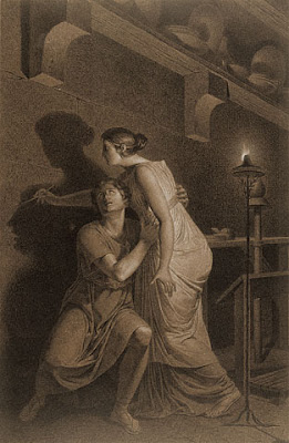
The Invention of Drawing: An Artist Reveals Perspective

The Getty Museum has this wonderful drawing, The Invention of Drawing, which documents one method of drawing. Illustrated here is an artist tracing the shadow of her model. Notice how the drawing is a precise rendering, done in two-point perspective. A single flame provides the light source for all of the shadows. The drawing contains a full range of values, from lightest lights to darkest darks. The horizon line, or eye level, is low, almost, if not exactly where the pencil touches the wall. Perspective lines are dramatically featured in the wall-mounted shelf, the lines of the furniture, and the stone wall grid.

Perspective drawing is a method of representing the appearance of objects, places, architecture and even people. Parallel lines are represented as converging, which gives the illustion of distance. There are many valuable sources to which one can refer in order to understand perspective. The following link is one good example that covers the basics of linear perspective.

Image information:
The Invention of Drawing (recto); Sketch of Lower Leg Bones of Human Skeleton (verso)
Joseph-Benoît Suvée
Belgian, about 1791
Black and white chalk on brown paper (recto); graphite (verso)_21 1/2 x 14 in.
87.GB.145

Tuesday
Jul032007

Ray and Charles Eames: An Illustrated Design Process

Currently teaching two classes, Sketching and Rendering for Industrial Design, and Basic Design, at Rhode Island School of Design, Drawing Connections readers will notice some entries are geared towards students. This is one such entry.

When developing drawing and design skills, it can be tremendously helpful to nearly simultaneously practice drawing and observe drawing practice. Practice. Practice. Find designers who use drawing as a part of their design process. Study the drawings.

The objectives of this exercise include:
1. comparing multiple examples of drawing styles and techniques;
2. understanding the act of drawing is an individual expression, and that each person will have their own drawing voice or style, unique from other people;
3. discovering appropriate drawing materials and substrates for design drawings;
4. considering how drawing can play a significant role in the design process;
5. exploring the use of line, from informal and rapid sketch, to the detailed finished rendering; and
6. seeing how designers employ the visual language of drawing to generate ideas for designs, think through a design problem, communicate plans to other audiences, and document important details in the process.

It does not take long to find a variety of examples, illustrating a considerable, respectable range of drawing approaches, styles and techniques.

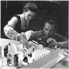
For the purposes of participating in the exercise, this article features the work of the married design team, Ray (1912–1988) and Charles (1907–1978) Eames, American designers, who accomplished many works of industrial design, furniture design, art, graphic design, film, and architecture. Below is a photo of Ray and Charles Eames working on an exhibition model.

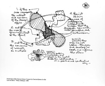
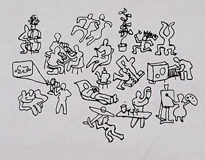
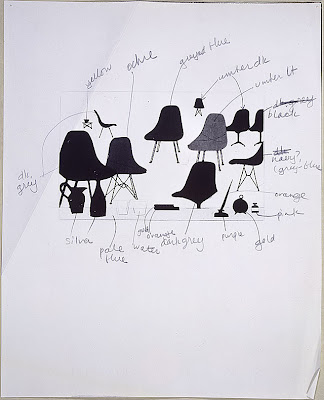
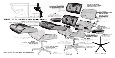
Below are some additional samples of their drawings. See a doodle-type drawing, by Charles Eames, which is themed about life around the house; collage drawing of an Eames chair, complete with a suite of accessories; and an exploded view of the Eames lounge chair. The bubble diagram, featured at the beginning of this article, illustrates the Ray and Charles Eames design process. If you are interested in learning more about the Eames’ work, explore the following links:
The Eames Office
The Eames Foundation
The Design Museum
“Exhibit: The Work of Ray and Charles Eames: A Legacy of Invention”
The Eames Gallery
Herman Miller